
Publishing 1: Print Media | Final Project Submission
1/11/17 - 6/12/17
Week 9 - Week 14
Leanne Faye 0327020
Publishing 1: Print Media
Instructions
Final Project & Portfolio (40%)The Brief
Magazine Design
Duration of Assignment
5 Weeks (Briefing on Week 9)
DEADLINE
Week 13 (29 Nov 2017) Printed Magazine
Week 14 (04 Dec 2017) Online Magazine
Description
You are required to design a magazine based on any chosen topic but within the field of creativity.
For example it can be on Performance Art, Creative Individuals, Art & Craft, Photography etc. You
will need to brainstorm ideas on the topic chosen, content of magazine, look & feel, concept,
typography as well as the magazine’s name.
You have to take into account the best approaches in designing the identity and branding of the
magazine. Define the purpose or function of the layout, the magazine’s audience, and the
information that needs to be communicated. In order to visualize this task, you will be need to be
creative and selective in the application of relevant elements for your magazine design. (ie. design
and layout, color palette and treatment, grid system, visuals and typography).
The magazine should have at least 16 pages but not more than 32 altogether, including the front
cover, content, editor’s note & credits, contributors and resource credits, main feature,
review/shorts, single page spread and back cover. Advertising space is optional. A detailed
research on the chosen topic is essential and project management skills are vital in order to
secure successful completion of this project.
The final magazine should contain information and visuals in order to communicate with the target
audiences. You are responsible in every aspect of its pre-production and production including
research, concept, content, design elements and the final execution. Remember, you must
establish unity across the entire format as identity and concept is essential to a magazine’s
representation. Successful magazine layouts must not only be legible and readable, it also needs
to be aesthetically pleasing as well as able to offer information in a creative and often
conceptualized manner.
You will be guided through lectures, demonstrations, tutorials and feedback sessions throughout
the duration of the project in response to the design process of designing a magazine. This
includes masthead design, thumbnail sketching, drafting and refining layouts as well as final
proofing. You will use Adobe InDesign in your execution of the magazine’s layout and design.
Proficiency in Adobe Illustrator and Adobe Photoshop is a must.
Requirements
The size of the magazine must be A4. You are required to print the magazine layout in full colour
and assemble a realistic mock-up for final submission. Subsequently the magazine will be
digitized and uploaded online. Please credit all sources where necessary.
Additionally, you must document your entire design process as your portfolio submission. This
includes but are not limited to:
Research
Research conducted for this project including visual, articles, edited visuals, notes, photographs,
mood boards, references, typography, grid system etc.
Concept development
Brainstorm sheets together with notes and sketches or any evidence of formatting, conceptualizing
as well as putting content into perspective. Include also a rational on the name chosen as well as
the identity and branding of the magazine.
Idea generation
Initial thumbnails, plans, sketches, draft layouts that document the visualization of the concept
chosen as well as the pace of the magazine. Evidence of typographic exploration documenting the
process of refining the magazine’s typographic identity, layout and grid system.
Design development
Document the process you undertook to produce your project including layouts, refined ideas, pre
finals as well as final proofs. Including notes in your layout to justify the design decisions you’ve
made along the way is recommended.
Final Artwork
Your final magazine must demonstrate your solution for the brief.
Submission
1. 16-32 page magazine of a professional finishing and quality not only in look but also in
content.
2. Research and design process filed chronologically, in an A3 portfolio.
3. Design report on e portfolio.
4. Online magazine.
5. CD archiving .indd and .pdf files.
Objectives
1. To develop students knowledge and understanding in print media.
2. To develop students ability to create layout for a different application and experience.
3. To develop students familiarity with the dynamics of design and its components.
4. To develop students confidence in working through the design process
5. To develop students time and project management skills.
Exercises (10%)
The Brief
The Brief
Exercises.
Duration of Assignment
Duration of Assignment
Continuous, throughout the semester
Description
Description
To develop your understanding of the practical employment of typography, a series of exercises will be implemented. Students will apply what they have learnt from lectures and discussions in these exercises, which will be assessed and contribute to the overall mark of the module. It is important that students work on these exercises with commitment in order to fully understand the design principles involved. The knowledge and skills developed will be applied to the accompanying projects.
All exercises prescribed are to be completed and documented (labelled, clean, clear & concise) in your e portfolio and hardcopy portfolio respectively.
The exercises are as follows:
The exercises are as follows:
1) Text formatting
2) Grid system variation
3) Brochure folds (8pg)
4) Magazine publishing online ✓
5) Masthead design ✓
Requirements
Requirements
To complete and to showcase mastery in the exercises prescribed in its various forms. The work is compiled chronologically in an A3 Folio and documented on the students’ e portfolio.
Submission
Submission
1. Exercises to be documented chronologically in an A3 Folio. The works must be labelled and dated. 2. E portfolio posts for every exercise labelled and dated.
Objectives
Objectives
1. To develop students theoretical understanding via practical means.
2. To develop students grasps to the components of the module.
3. To develop students explorative and innovative spirit.
4. To develop students practical application of the design process.
Exercises
1) Magazine publishing online
Link to online publication of The Artifact Magazine:
Flippingbook:
https://online.flippingbook.com/view/489745/
Issuu:
https://issuu.com/leannefaye/docs/magazine_draft_5_rgb
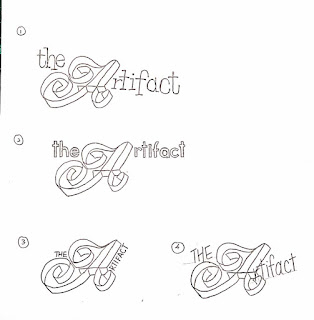
2) Masthead Design


1) Magazine publishing online
Link to online publication of The Artifact Magazine:
Flippingbook:
https://online.flippingbook.com/view/489745/
Issuu:
https://issuu.com/leannefaye/docs/magazine_draft_5_rgb
2) Masthead Design

Sketches

Further Sketches of (6)

Digital Ver.

Trying different typefaces.

Trying different thickness of strokes. (Caslon Regular)
Revised Ver.
Final Masthead.
Final Project
Fonts
Week 11


*use body text and subhead text


*use headline text


Week 12

*change headline text to Baskerville
Week 13

*Final text format
Thumbnail Sketches
Week 10


Week 11
*further thumbnail sketches for 6 columns

3 columns

4 columns

5 columns

6 columns
*more dynamic
Week 11
*further thumbnail sketches for 6 columns


*more focused and consistent
Week 12


*Ms. Lilian's rough sketch
Research
Name
The Artifact
Content
Magazine that showcases art movements from different eras and includes all information you have to know about the art movements. From theatre, to architecture, to fine arts, to historical development and many more. The art movement that are included in The Artifact is Rococo Artistic Movement, Classicism Art Period and Minimalism Art Movement.
Target Audience
Young and Old. People from all age groups. People who appreciates/loves art, designers, architects, artists and people who works in the creative industry.
Look and feel
Research on Magazine Layout.

Beginnings of print magazines
First publication, which could be called a magazine, was the German Erbauliche Monaths Unterredungen, released in the year 1663. It was a literary and philosophical edition and after it was launched several periodicals with very similar topics were published, and were intended for an intellectual audience.
Thematic scope was very narrow, and it was mainly written by one author. A publication similar to today’s magazines (various themes and several authors) appeared in the year 1672, when French author Jean Donneau de Vize created Le Mercure Galant. It combines topics from court events, theater and literature, and this magazine concept was copied throughout Europe. The first women’s magazine, Ladie’s Mercury, was launched in London in the year 1693. Of course, these publications in their beginnings were called periodicals.
Name “magazine” appeared in the year 1731 with the occurrence of the Gentleman’s Magazine. The name magazine, which comes from the Arabic word which means the warehouse, and was used for describing the place which deposits large quantity of various goods, while the analogy used to describe a book that contained many useful information for travelers and sailors.
The success of the magazine was great, but the costs of every issue were even higher. Printing cost was high, and the number of printed copies could not be greater than one hundred thousand, because it was technically impossible to squeeze a larger amount of paper through the machine. Distribution was also a big problem because it was difficult to move large quantities of magazines at great distances.
First Ad Pages
In the mid 19th century readers were not only the rich ones and magazines become available to the middle class. This was beginning for the first family magazines, such as, Dickens Household Words. During the 19th century, increasing attempts was made to cut the price of the magazines. At this time the first ads appeared, but not much because the ads were loaded with special tax, all up to 1853.
After the repeal of the tax, number of ads did not increase since many publishers avoided this type of income (Readers Digest magazine did not publish ads until 1955). In the late 19th century and with the invention of the rotary press, the number of printed copies increases, and the price of the issue is reduced and thus we enter the century, that will mark the development of the magazines as one of the world’s leading media.
With technological progress, increased circulation, and increasing use of images, magazines are becoming increasingly attractive to advertisers. The first advertising agency was established in 1890 and from that point on advertising started to flourish.
Rise of Magazines
In the early 20th century appears one of the most important icons in the world of publishing, William Randolph Hearst. As the owner of several newspapers across America, he engages in a merciless battle for readers with his mentor, Joseph Pulitzer. During the Cuban War for Independence, Hearst and Pulitzer published in their newspapers images of tortured and starving Cuban troops. At this moment arises the term yellow journalism, which marks the sensationalist approach to the presentation of events.
Hearst expanded his empire to magazine publishing starting with the famous Good Housekeeping, National Geographic and Harper’s Bazaar. Besides Hearst’s magazines, some other important publications appear such as Conde Nast’s Vogue, Vanity Fair and news magazine Time, whose starter Henry Luce is still considered the most influential publisher in history.
Although Luce launched Time, he was not a visionary and he did not guide the magazine. He actually stole the idea for the first political weekly from his colleague at Yale, Britton Hadden.
Hadden was responsible for conceiving the concept of the political news magazine, and he as the editor of the Time, formed personality of the magazine, gained loyal readers, and brought the financial profit to the company. The same company will issue several well-known magazines such as Life, Sports Illustrated and Money.
Research on Rococo.
Key Date: 1600-1800
Rococo, less commonly roccoco, or "Late Baroque", is an early to late 18th-century French artistic movement and style, affecting many aspects of the arts including painting, sculpture, architecture, interior design, decoration, literature, music, and theatre. It developed in the early 18th century in Paris, France as a reaction against the grandeur, symmetry, and strict regulations of the previous Baroque architectural style, especially of the Palace of Versailles, until it was redone. Rococo artists and architects used a more jocular, florid, and graceful approach to the Baroque. Their style was ornate and used light colours, asymmetrical designs, curves, and gold.
Rococo is a portmanteau word combining both “rocaille” (French for “shell”) and “barocco”, Italian for Baroque, the art style preceding the Rococo period. Rococo art extensively feature shell-shaped curves and wave-like motifs, particularly in its sumptuous furniture design and interior décor.
Rococo furniture and architecture was defined by a move away from the austere religious symmetrical designs of the Baroque. Instead, they focused on secular, more light-hearted, asymmetrical design, while continuing the Baroque penchant for decorative flair. In art, light colors, curvaceous forms and graceful lines became characteristic of the Rococo movement. Canvases were adorned with cherubs and myths of love, while keeping with the jocular trend of the period, portraiture was also popular. The Rococo artists moved away from the intense dramatics of the Baroque period and became more playful in their works. Although many artists flourished during the Rococo Movement, the most renowned are François Boucher, Jeane Antoine Watteau and Jean-Honoré Fragonard.
Rococo Art

The Swing, 1767, by Jean-Honore Fragonard
Rococo Versailles

The Rococo Basilica, Imperial Abbey of Ottobeuren.

Hermitage Museum, Saint Petersburg, Russia.
Research on Classicism.
Key Date: 1800-1900
Classicism, in the arts, refers generally to a high regard for a classical period, classical antiquity in the Western tradition, as setting standards for taste which the classicists seek to emulate. Classicism is a force which is often present in post-medieval European and European influenced traditions; however, some periods felt themselves more connected to the classical ideals than others, particularly the Age of Enlightenment, when Neoclassicism was an important movement in the visual arts.
In ancient Rome, the citizens of the first rank were called classici. When Aulus Gellius (19.8.15) contrasted a scriptor classicus with a scriptor proletarius, the description carried an implication of quality which is still current: we speak of a work being a 'classic' in the sense that it is a model which deserves to be followed. The French were using classique in this manner in the sixteenth century but it was not until the eighteenth century in England and France that the term 'the classics' came to mean precisely the masterpieces of Greek and Latin literature. Since at that time a classical education was acknowledged as the only correct training for civilized life, such an extension of meaning is not surprising. In the history of art as in the history of literature, classicism is an approach to the medium founded on the imitation of Antiquity, and on the assumption of a set of values attributed to the ancients.
Developing in Rome in the late 15th century, the classical style was widespread particularly among the Renaissance artists. Their aim was to capture the precision of the antique age which for them represented the possibility of attaining absolute beauty in their art. Using examples such as the ‘Belvedere Torso’ and the ‘Medici Venus’, the artists rejected emotionalism in favour of attention to form and detail.
The style’s main exponents included Michelangelo, Raphael, Correggio and Mantegna. The classical style was revived in the late 18th and early 19th century in Neoclassicism a movement that arose in reaction to the flamboyant Rococo style and which included artists such as Anton Raffael Mengs and Johan Joachim Winckelman.
Classicism Art

A Young Lady In Pink, 1889 – 1954, by Tade Styka
Classicism Architecture

Ralph Lauren's Flagship Store, New York City.

US Supreme Court, Washington, DC.
Research on Minimalism.
Key Date: 1960-1970s
Minimalism began in post–World War II Western art, most strongly with American visual arts in the 1960s and early 1970s. Prominent artists associated with minimalism include Donald Judd, John McCracken, Agnes Martin, Dan Flavin, Robert Morris, Anne Truitt, and Frank Stella.[1][2] It derives from the reductive aspects of modernism and is often interpreted as a reaction against abstract expressionism and a bridge to postminimal art practices.
Minimalism in music often features repetition and iteration such as those of the compositions of La Monte Young, Terry Riley, Steve Reich, Philip Glass, and John Adams. The term minimalist often colloquially refers to anything that is spare or stripped to its essentials. It has accordingly been used to describe the plays and novels of Samuel Beckett, the films of Robert Bresson, the stories of Raymond Carver, and the automobile designs of Colin Chapman. The word was first used in English in the early 20th century to describe "a 1913 composition by the Russian painter Kasimir Malevich of a black square on a white ground".
Minimal art is also inspired in part by the paintings of Barnett Newman, Ad Reinhardt, Josef Albers, and the works of artists as diverse as Pablo Picasso, Marcel Duchamp, Giorgio Morandi, and others. Minimalism was also a reaction against the painterly subjectivity of Abstract Expressionism that had been dominant in the New York School during the 1940s and 1950s.
Minimalism Interior Design

*Not stated where and by who.
Minimalism Graphic Design

London Poster, by unknown.
Minimalism Architecture

AR House, Atizapán de Zaragoza, Mexico, by Lucio Muniain
Research on Art Magazine.
Whitewall
Whitewall is the only independent art and luxury lifestyle magazine. Published quarterly, Whitewall began to set new standards for high-end, luxury publications with its launch in March 2006. Since then it has gained international acclaim. The magazine aims to go beyond the stark white walls of the art gallery to reveal the personalities that shape the art world and other creative industries. Whitewall delivers an unprecedented intimate experience for the most discerning readers.


Art Forum
Artforum is an international monthly magazine specializing in contemporary art. The magazine is published ten times a year, September through May, along with an annual summer issue. Distinguished by its 10½ inch square format, with each cover devoted to the work of a single artist, the magazine is widely acknowledged as a decisive voice in its field.
The magazine features in-depth articles and reviews of contemporary art, as well as book reviews, columns on cinema and popular culture, and numerous full-page advertisements from prominent galleries around the world.
Artforum was founded in 1962 in San Francisco by John P. Irwin, Jr. The next publisher/owner Charles Cowles moved the magazine to Los Angeles in 1965 before finally settling it in New York City in 1967, where it maintains offices today. The move to New York also encompassed a shift in the style of work championed by the magazine, moving away from California style art to Late modernism, then the leading style of art in New York City. The departure of Philip Leider as editor-in-chief in 1971; and the tenure of John Coplans as the new editor-in-chief roughly coincided with a shift towards more fashionable trends and away from Late modernism. A focus on Minimal Art, Conceptual Art, Body art, Land art and Performance art provided a platform for artists such as Robert Smithson, Donald Judd, Sol LeWitt and others. In 1980 after opening his own gallery in New York City Charles Cowles divested himself of the magazine. Sister magazine Bookforum was started in 1994.


ArtReview
ArtReview is an international contemporary art magazine based in London. Its sister publication ArtReview Asia has an Asian perspective and is based in Shanghai. ArtReview covers established and emerging artists in a mixture of international exhibition reviews, artist profiles, city art tours and artist commissions, including artist projects published as supplements to the regular edition of the magazine. Annual features include the Power 100, a guide to the 100 most powerful figures in contemporary art, published in the November issue of the magazine; and Future Greats, a selection of emerging artists, published in the March issue. Its current editors are Mark Rappolt and David Terrien.
ArtReview was founded in London in 1949 by a retired country medical practitioner, Dr Richard Gainsborough, and the first edition was designed by his wife, the artist Eileen Mayo. Over its 60 years of continuous publication, it has evolved from an eight-page black-and-white broadsheet newspaper published fortnightly to a magazine format published nine times a year. The magazine is distributed in 28 countries.


Main Feature
Jesse Mockrin’s Cropped Rococo Paintings Break the Spell of Art History
Full Article from:
Article
The Dark Side of Classicism
Full Article from:
Review
Goodbye, Things. The New Japanese Minimalism By Fumio Saski.
Book Review by Frederic and Mary Ann Brussat
Full Article from:
Edited Visuals
1) Before

A Young Lady In Pink, 1889 – 1954, by Tade Styka
After

2)

Royal Palace of Venaria by Amedeo Di Castellamonte, Italy.
3)

Minimalism and Applied II, Daimler Contemporary Berlin.
4)

The Storm, 1880, by Pierre Auguste Cot.
5) Before


View of the exhibhition, "THE PROGRESS OF LOVE " at Night Gallery Los Angeles (USA), 2016
After

6)


View of the exhibhition, "THE PROGRESS OF LOVE " at Night Gallery Los Angeles (USA), 2016
7) Before

View of the exhibhition, "THE PROGRESS OF LOVE " at Night Gallery Los Angeles (USA), 2016
After

8)


After


View of the exhibhition, "THE PROGRESS OF LOVE " at Night Gallery Los Angeles (USA), 2016
9) Before

View of the exhibhition, "THE PROGRESS OF LOVE " at Night Gallery Los Angeles (USA), 2016
After
10)

Würbel, Theodor Franz 1886 -. Olympische Spiele Berlin. Offset 1936.
11)


Light Walls House By Ma-Style Architects, Japan.
12)
Victorian Classicism Art by unknown.
Draft Layout
Week 11
1st draft (thumbnail)

1st draft (pdf)

2nd draft (pdf)
Week 12
3rd draft (thumbnail)

3rd draft (pdf)
4th draft (thumbnail)


4th draft (pdf)
Final Magazine
Final Thumbnail Layout

Link to online publication of The Artifact Magazine:
Flippingbook:
https://online.flippingbook.com/view/489745/
Issuu:
https://issuu.com/leannefaye/docs/magazine_draft_5_rgb
Reflection
Experience
The process of this whole project went smoother than I expected. There were lesser hiccups because it is our third and last project for Publishing 1, therefore, we are already familiar with the process of publishing print medias.
Why did I choose to do an art magazine is because I wanted to do something different. I saw a gap in our generation's interest, my generation only think of fashion, food or car when it comes to magazines. We don't often see art-related magazines in bookstores or convenient stores and I wanted to embrace that. I did 3, 4, 5 and 6 columns thumbnail sketches because I wasn't sure which columns works best for my magazine theme but Ms. Lilian suggested 6 columns looked more dynamic compared to the rest, that's why I went with 6 columns. I did research on types of art movements, magazine history and art magazines. The research has provide me much better understanding on these aspects and the content.
Lastly, printing for my magazine went good but except I faced a problem which is my cover page had creases and cracks on the fold and I learned that thicker paper, depending on the type of paper too, had to be laminated in order to avoid creases and cracks.
Observation
One thing that is very evident that I observed during this project is that all of us are more independent compared to previous projects. I find myself making better decisions and I am a very introspective person therefore, I do reflect & examine on my work and how would it affect me and others. I realized in my masthead exercise I did more digital work than hand sketches because I find myself working faster with software. Although, I am trying and learning to work more on my hands on work, like sketching.
Findings
I find that I was a bit scared and hesitant at the beginning of this project because it is my first project in this module having to work with pages. And, because I had lesser text, I was lost in how to work with big spaces. Besides that, I really found a lot of good reads and new information about magazines and it has also increased my interest in art movements/periods. Frankly speaking, I enjoyed doing this project the most out the all 3 projects, there is this very satisfactory feeling when doing this project.
Further References
Online reading materials
1) Formatting Paragraphs - getting rid of orphans and widows.
2) History of Magazines.
http://www.magazinedesigning.com/history-of-the-magazines/
3) The Rococo Art Movement That Dominated The Seventeenth & Eighteenth Century
http://all-that-is-interesting.com/rococo-art-movement
http://www.magazinedesigning.com/history-of-the-magazines/
3) The Rococo Art Movement That Dominated The Seventeenth & Eighteenth Century
http://all-that-is-interesting.com/rococo-art-movement
4) Master Pages
http://guides.lib.umich.edu/c.php?g=282834&p=1884599
Video materials
1) How to Stretch Images using Content Aware Scale (PS Tutorial)
http://guides.lib.umich.edu/c.php?g=282834&p=1884599
Video materials
1) How to Stretch Images using Content Aware Scale (PS Tutorial)
Books read through out the project
1)


Turning Pages: Editorial Design for Print Media
by Robert Klanten & S. Ehmann
In this book, it documents the current evolution in print media and introduces the leading creative protagonists at its forefront as well as how they work. It includes internationally renowned editorial designers present their projects and comment on the various stages of a publication's conceptualization, design, and production. These range from topic selection, structure, and flow to more specific aspects such as type area, layout, typography, pictorial language, navigation, and cover design. Turning Pages is a survey of what is state-of-the-art in editorial design today as well as an inspirational forecast of future developments. Its unique mix of visual examples, insightful descriptions, and reports based on personal experiences make the book a compelling reference for designers and those working in the media industry.
There is one saying in this book by Russell Davies from THENEWSPAPERCLUB (page 7) that had me pondering on and agreeing to was, "The web lets us all be publishers, and short-run print will let us publish the things many of us have always loved - books, magazines, newspapers... objects and form factors that have evolved to do all sorts of things really well, but which have always been inaccessible to most people. In some ways this will reduce the specialness of print - less exclusive, less curated, less quality control - in others it'll make it more special - more personal, more relevant, more ours. And, I suspect, we'll discover new things we can do with print, things that just weren't economic before. And some of them will be wonderful.".
2)

Layout Now: The Proportion of Text and Graphics
by Sendpoints/ Ed.
The reason why I love and bought this book was because this book breaks down layout basics and principles, with a stress on grids-based approaches. It also features a range of outstanding design cases with deconstructed layouts by grid system or color blocks, giving a wide perspective on the methods in print design. This book provides detailed interpretation of the layout basics, from paper sizes to grid systems.And, a selection of layout design projects illustrated with grids and color blocks, analyzing the visual elements and the proportion of text and graphics. Lastly, it includes designers sharing their visual goals and viewpoints on grids too.
Two magazine layouts that I was inspired by:

Bau Magazine, a bimonthly magazine about modern architecture and industrial design. And, because its about modern architecture and industrial design, the visual identity of the whole piece should reflect modernism: where the periods when design grew up in wide steps.
Designed by Mane Tatoulian. Typeface: Helvetica Neue LT.

Piera Magazine, an architecture magazine for a broader and non-expert audience, published by the Architecture Foundation of Treviso. The visual identity is giving the reader a chance to immediately recognize the different sections of the magazine charactarized by different layouts and combination of typeface without oveshadowing the importance of content with intricate and unnecessary graphics.
Designed by Studio Iknoki. Typeface: Helvetica Neue, Times, Courier.

0 comments