
Publishing 1: Print Media | Project 2 & Exercises
4/10/17 - 8/11/17
Week 6 - Week 10
Publishing 1: Print Media
Instructions
Project 2 (30%)
The Brief
Brochure Design
Duration of Assignment
3 Weeks (Briefing on week 6)
Deadline
Week 9 (01 Nov 2017)
Description
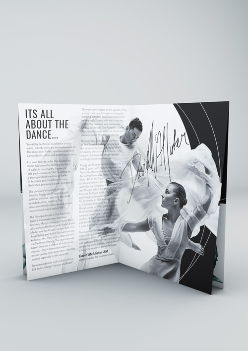
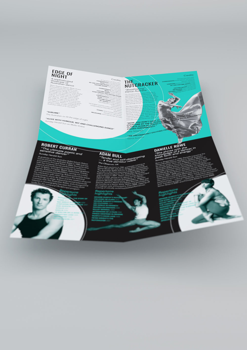
You will conceptualize, design and produce a brochure on a topic assigned to you. The text will be provided for you but you will have to display creativity in the execution of visual dynamics with text and page layout. Conceptualize an appropriate setting for the design of the brochure and take information from there to create more design details. For example, to accompany an artshow, background information on a play, etc.
You will tell the story connected to the topic as a brochure of no more than 8 pages. The brochure must contain a cover, the article, visuals, information as well as a back cover. The execution of this brochure is an introduction and exercise to formatting and arranging a large body of text to provide a clear and informative physical representation of the topic given.
As you progress, lectures, tutorials and discussions will support your understanding of this design area. It is important that you develop an in-depth understanding of publishing design through analyzing the linear manner a brochure communicates information and ideas to its reader. You will use Adobe InDesign in your execution of the brochure layout. Proficiency in Adobe Illustrator and Adobe Photoshop is a must.
Finally, you shall explore how to digitally publish your brochure online. As this is an experimentation in progress, it shall be a learning process done during contact hours with your lecturer. The aim would be to successfully publish the brochure online.
Requirements
The size of the brochure will be no larger than A4 (when folded) for considerations of economy. You may use any colour of your choice, full-colour if necessary, for the communication of the topic. You may be resourceful to acquire visuals from different sources but ensure that you credit these sources accordingly. The work is compiled chronologically in an A3 Folio and documented on the students’ e portfolio.
Submission
1. 8 page brochure in colour/black and white of a good standard of crafting.
2. Research and design process filed chronologically, in an A3 folio.
3. Design report on e portfolio.
4. Digital publication of brochure.
Objectives
1. To develop students ability to produce layout of a good standard.
2. To develop students ability to create a suitable grid system that allows them flexibility.
3. To develop students understanding of the relationship between text and image.
4. To develop students ability to manage a large body of information while prioritizing aesthetics and function.
5. To develop students discovery of the digital publishing platform.
Exercises (10%)
The Brief
The Brief
Exercises.
Duration of Assignment
Duration of Assignment
Continuous, throughout the semester
Description
Description
To develop your understanding of the practical employment of typography, a series of exercises will be implemented. Students will apply what they have learnt from lectures and discussions in these exercises, which will be assessed and contribute to the overall mark of the module. It is important that students work on these exercises with commitment in order to fully understand the design principles involved. The knowledge and skills developed will be applied to the accompanying projects.
All exercises prescribed are to be completed and documented (labelled, clean, clear & concise) in your e portfolio and hardcopy portfolio respectively.
The exercises are as follows:
The exercises are as follows:
1) Text formatting
2) Grid system variation
3) Brochure folds (8pg) ✓
4) Magazine publishing online
5) Masthead design
Requirements
Requirements
To complete and to showcase mastery in the exercises prescribed in its various forms. The work is compiled chronologically in an A3 Folio and documented on the students’ e portfolio.
Submission
Submission
1. Exercises to be documented chronologically in an A3 Folio. The works must be labelled and dated. 2. E portfolio posts for every exercise labelled and dated.
Objectives
Objectives
1. To develop students theoretical understanding via practical means.
2. To develop students grasps to the components of the module.
3. To develop students explorative and innovative spirit.
4. To develop students practical application of the design process.
Exercises
1) Brochure Folds 8pg (Week 6)
*Grouped with Kathryn and Arif


Project 2
Fonts
Week 6


*Final Choice


Thumbnail Sketches
Week 7


*box to indicate the layouts to be further explored after feedback from lecturer.
Research
Research on Brochures.
A brochure is an informative paper document that can be folded into a template, pamphlet or leaflet. Brochures have a long history in our world. They represent small leaflets with advertisement purposes. A brochure can advertise locations, hotels, events, services, products, etc. Brochures are usually available in shops, hotels and other places likely to attract people. Brochures are an effective way to promote a certain event or location, since a brochure often contains images and text, creating a multimedia experience for the viewer. Due to their folding design, brochures can create not just two-dimensional representations, but also three-dimensional objects.
A brochure has three functions:
Best Practices When Creating a Brochure


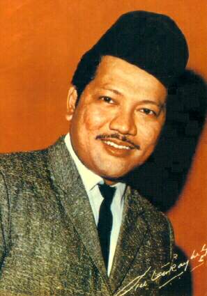
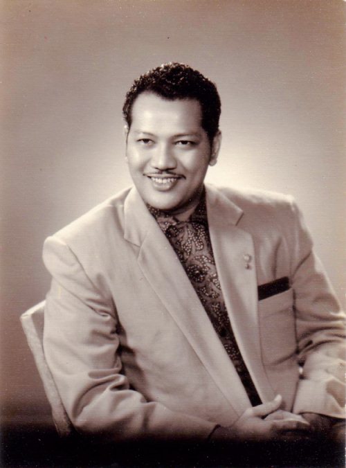
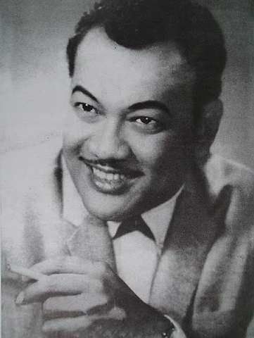
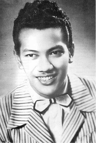
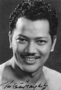
Research on P. Ramlee.
Biography
Tan Sri Datuk Amar Teuku Zakaria bin Teuku Nyak Putih (Jawi: تاوكو زكريا تاوكو ڽق ڤوتيه), commonly known as P. Ramlee (22 March 1929 – 29 May 1973) was a Malaysian film actor, director, singer, songwriter, composer, and producer. Due to his contributions to the movie and music industry and his literary work, which began with his acting debut in Singapore in 1948 to the height of his career and then later moving to Malaysia in 1964 onward where he moves towards his decline and death, he is regarded as a prominent icon of Malay entertainment; with his famed even reaching as far as Brunei and Sumatra, Indonesia as well as in Hong Kong and Japan.
Film Career
His first screen appearance was in Chinta, a B. S. Rajhans-directed film produced by Malay Film Productions in 1948. Between 1948 and 1955, he has starred in a total of 27 films. He eventually ventured into film directing under the mentoring of Madras-born director L. Krishnan.
Singing Career
P. Ramlee, as he came to be called, showed a flair for music and taught himself the ukulele and violin at a young age. He would get together with friends to sing contemporary songs and keroncong tunes, and eventually, people began inviting him to entertain at social gatherings.
The icon rose to stardom after emerging third in a singing contest organised by Penang Radio for North Malaya. Beginning in 1945, he entered the same contest three consecutive times and finally became the winner in 1947.
News reached the ears of a renowned film director in Singapore by the name of B.S. Rajhans, who invited P. Ramlee to work at his studio. Initially, his voice was used in background songs for Malay films but soon, he was appearing in front of the camera, and then found his way into directing.
P. Ramlee was also noted as a composer, lyricist and arranger. The multitalented performer garnered multiple awards for his works and reached the peak of his fame when he was named Most Versatile Talent at the Asia-Pacific Film Festival in Tokyo in 1963. He received this honour for the film Ibu Mertuaku.
Ramlee also composed around 250 songs. Noted for his musical versatility, Ramlee explored a repertoire of genres, ranging from jazz to joget (a popular Malay folk dance). The last song he composed and sang was “Air Mata di Kuala Lumpur” in 1973.
Selected Awards
1956: Best Musical Score for Hang Tuah (Legend of Hang Tuah), Third South-East Asian Film Festival, Hong Kong
1957: Best Male Actor for Anak-ku Sazali (My Son, Sazali), Fourth Asian Film Festival, Tokyo
1959: Best Comedy Film for Pendekar Bujang Lapok (The Three Bachelor Warriors), Sixth Asian Film Festival, Kuala Lumpur
1960: Best Comedy Film for Nujum Pak Belalang (Fortune Teller), Seventh Asian Film Festival, Tokyo
1963: Most Versatile Talent for Ibu Mertua Ku (My Mother-in-Law), Tenth Asian Film Festival, Tokyo
1964: Best Comedy Film for Madu Tiga (Three Rivals), Eleventh Asian Film Festival, Taipei
Research on Visuals

Research on Songs.
A brochure has three functions:
- Informative function: a brochure is usually used to inform your potential customers with regards to your company. This information is related to your company presentation, a new product or service that your company offers, or a recent change in your company name, etc.
- Advertising function: a brochure is really important as an advertising tool, which attractively allows you to promote one or more products or services. For further details this function will be analyzed in the section called Advertising aspect.
- Identification function: a well-done brochure design allows you to maintain a same criterion through all your company brochures. If this criterion (sometimes called concept) is unified in all the brochure types, it will make your company to be recognized automatically. It will give to your company prestige and credibility. It is important for your company brochure not only have a “concept”, but also to have a logo: a well designed logo is essential for any company, is one of the first steps to start an advertising campaign.
Best Practices When Creating a Brochure
- Identify your target audience. A target audience is a specific group of people at whom your product or service is aimed. A target audience may describe people of a specific age group, profession, income level, gender, marital status, and so on or any combination of these factors. The brochure needs to be designed with your target audience in mind. For example a brochure aimed at young moms should look and feel different from a brochure aimed at recent retirees.
- Select an appropriate format. Based on your target audience, determine the format of the brochure. The format includes such elements as the size, type of paper, and number of folds. You may also want to think about how the brochure will be distributed. Will it be mailed or handed out at an event?
- Determine the type of information to include. The information that is included varies from one brochure to the next. The brochure may include the organization's mission statement, product features, charts and graphs, instructions, photos, and a logo. To help decide what to include, think about what purpose the brochure serves. Is it to remind a prospect about the basics of your business or is it to sell a specific service or product, in which case you'll want to make sure your prospect knows what to do next: visit your website, enter a code, call a special phone number, etc.
- Lay out the content. The key is to keep your brochure design simple and effective. Too much information may cause the brochure to appear cluttered. As a result, your message will be lost. Limit the number of colors used to between two and four and use each color consistently. For example, use one color for the headings and subheadings, and another for general text.
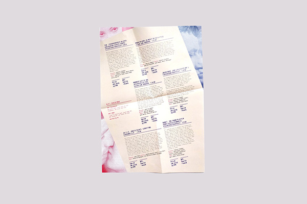
Most common type of brochure fold.
Source: http://oahuprint.com/folding/
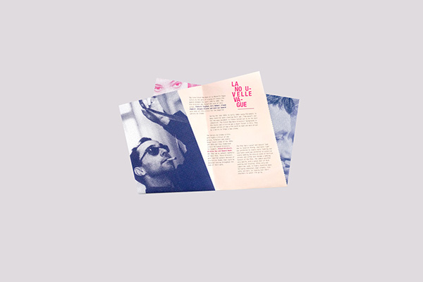
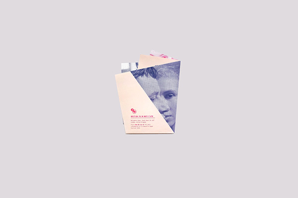
British Film Institute unique French fold brochure.
Body torque French fold brochure.
Research on P. Ramlee.
Biography
Tan Sri Datuk Amar Teuku Zakaria bin Teuku Nyak Putih (Jawi: تاوكو زكريا تاوكو ڽق ڤوتيه), commonly known as P. Ramlee (22 March 1929 – 29 May 1973) was a Malaysian film actor, director, singer, songwriter, composer, and producer. Due to his contributions to the movie and music industry and his literary work, which began with his acting debut in Singapore in 1948 to the height of his career and then later moving to Malaysia in 1964 onward where he moves towards his decline and death, he is regarded as a prominent icon of Malay entertainment; with his famed even reaching as far as Brunei and Sumatra, Indonesia as well as in Hong Kong and Japan.
Film Career
His first screen appearance was in Chinta, a B. S. Rajhans-directed film produced by Malay Film Productions in 1948. Between 1948 and 1955, he has starred in a total of 27 films. He eventually ventured into film directing under the mentoring of Madras-born director L. Krishnan.
Singing Career
P. Ramlee, as he came to be called, showed a flair for music and taught himself the ukulele and violin at a young age. He would get together with friends to sing contemporary songs and keroncong tunes, and eventually, people began inviting him to entertain at social gatherings.
The icon rose to stardom after emerging third in a singing contest organised by Penang Radio for North Malaya. Beginning in 1945, he entered the same contest three consecutive times and finally became the winner in 1947.
News reached the ears of a renowned film director in Singapore by the name of B.S. Rajhans, who invited P. Ramlee to work at his studio. Initially, his voice was used in background songs for Malay films but soon, he was appearing in front of the camera, and then found his way into directing.
P. Ramlee was also noted as a composer, lyricist and arranger. The multitalented performer garnered multiple awards for his works and reached the peak of his fame when he was named Most Versatile Talent at the Asia-Pacific Film Festival in Tokyo in 1963. He received this honour for the film Ibu Mertuaku.
Ramlee also composed around 250 songs. Noted for his musical versatility, Ramlee explored a repertoire of genres, ranging from jazz to joget (a popular Malay folk dance). The last song he composed and sang was “Air Mata di Kuala Lumpur” in 1973.
Selected Awards
1956: Best Musical Score for Hang Tuah (Legend of Hang Tuah), Third South-East Asian Film Festival, Hong Kong
1957: Best Male Actor for Anak-ku Sazali (My Son, Sazali), Fourth Asian Film Festival, Tokyo
1959: Best Comedy Film for Pendekar Bujang Lapok (The Three Bachelor Warriors), Sixth Asian Film Festival, Kuala Lumpur
1960: Best Comedy Film for Nujum Pak Belalang (Fortune Teller), Seventh Asian Film Festival, Tokyo
1963: Most Versatile Talent for Ibu Mertua Ku (My Mother-in-Law), Tenth Asian Film Festival, Tokyo
1964: Best Comedy Film for Madu Tiga (Three Rivals), Eleventh Asian Film Festival, Taipei
Research on Visuals
Source:
Source:
Source:
Source:
Source:
Source:
1.Azizah
The first song he composed was none other than “Azizah”. It was written in 1945 and dedicated to his first love which thrust him on the threshold towards stardom. He gave the song its first public airing at an Agricultural Fair in Bukit Mertajam in June 1948. The song later became his signature hit and was used in his directorial debut, Penarek Becha (The Trishaw Puller, 1955). Shortly after, he played a villain in Chinta (Love, 1948) and lent his voice to film soundtracks.
2.Getaran Jiwa
The piano in 'Getaran Jiwa' was played by Ismail Kassim. He was a last minute replacement for Ahmad Wan Yet who couldn't make it to the recording session. English singer Lobo recorded English version of 'Getaran Jiwa' called 'Whispering in the Winds' in 1970s. Sheila Majid recorded a cover version of 'Getaran Jiwa' for her 'Legenda' (Tribute to P Ramlee) album in 1993. The Bolshoi Ballet Orchestra Of Tashkent recorded a classical version of 'Getaran Jiwa' in its tribute to P Ramlee album. Rap group KRU did a cover version of 'Getaran Jiwa' recorded "duet" with the late P Ramlee.
3.Dendang Perantau
'Dendang Perantau' is one of the frequently played songs during the Idil Fitri celebration. There are two versions of 'Dendang Perantau' recorded by P Ramlee. Andre Goh recorded a cover version of 'Dendang Perantau' in 1970s. The Bolshoi Ballet Orchestra Of Tashkent recorded a classical version of 'Dendang Perantau' in its Tribute to P Ramlee album.
4.Di Mana Kan Ku Chari Ganti
‘Di Mana Kan Ku Chari Ganti' which means 'Where Do I Find A Replacement?' became a popular phrase to describe the legendary P Ramlee. Saloma recorded the female version of 'Di Mana Kan Ku Chari Ganti'. Sheila Majid recorded a cover version of 'Di Mana Kan Ku Chari Ganti' for her 'Legenda' (Tribute to P Ramlee) album in 1993. The Bolshoi Ballet Orchestra Of Tashkent recorded a classical version of 'Di Mana Kan Ku Chari Ganti' in its tribute to P Ramlee album. Liza Hanim recorded a cover version of 'Di Mana Kan Ku Chari Ganti' for her 'Di Mana Kan Ku Cari Ganti' (Tribute to P Ramlee) album in 1998.
5.Jangan Adek Angan Angan
'Jangan Adek Angan-Angan' was voted 'Lagu Sukaramai' / 'Favorite Song' by readers of 'Gelanggang Magazine' in 1960. P Ramlee recorded the original song with Rahmah Rahmat for 'Musang Berjanggut' (1959). Sharifah Aini and M Sani recorded a cover version of 'Jangan Adek Angan Angan' in 1970s.
Edited Visuals
Week 7
1)


Draft Layout
Week 7
French Fold with Short End
1) *to be further amend.


2) *to be further amend.


2) *Amendments after feedback


Final Layout


1)


1)

Original Visual

1st Attempt
2nd Attempt
3rd Attempt

4th Attempt
5th Attempt
2)
Original Visual
1st Attempt
2nd Attempt
3)

Original Visual
1st Attempt
2nd Attempt
3rd Attempt
4th Attempt
5th Attempt
4)

Original Visuals
1st Attempt
5)

Original Visual
1st Attempt
2nd Attempt
4th Attempt
5th Attempt
Week 7
French Fold with Short End
1) *to be further amend.

Front

Back
2) *to be further amend.

Front

Back
3)

Front

Back
4)

Front

Back
Week 8
1) *Amendments after feedback

Front

Back


Final Layout

Front

Back
Feedback
Reflection
Experience
The exercise for this project is fun yet challenging. We came out with a variety of brochure folds and we shared and explained to the class. Each group came out with different styles, some group had complicated folds while some had simple folds that works well. On the second week of the project, I did research and also listened to some of his well-known songs because I decided to design a brochure for a P.Ramlee Singing Contest called "The Lagu Competition". The song that I like most is "Getaran Jiwa", that is why I included the first lyric verse of the song in my brochure - "Getaran jiwa melanda hatiku. Tersusun nada, irama dan lagu. Walau hanya sederhana. Tetapi tak mengapa.", which translates to "Soul vibration hits my heart. Tones, melody and songs arranged. Even if it is just ordinary. But it's okay.".
Moving on, sketching the thumbnail sketches isn't as easy as project 1, we had to consider how would it look like as a spread. We had 8 pages to work on therefore, each page had to look good on its own as well as when spread opened. I did a lot of photoshopping for this project compared to the previous project because the concept I chose to went with is dual tone, bright visuals. My concept is also heavy and condensed typography. For this project, printing was smooth and there wasn't many mistakes.
Observation
I noticed that working with given text is not easy. We had to format the text according to our layout. Creating paragraphs, italicizing words to create emphasis and texture, getting rid of hyphenations and reference number. I learned how to photoshop images and applying them into InDesign without reducing the image resolution. I find it hard to look for clear photographs of P.Ramlee because cameras during that era weren't as advanced as they are now, therefore, there is a limitation of image size when I do my layout in InDesign. I observed that my brochure fold I chose is much challenging than other type of folds as 2 pages had to be rotated 180 degrees. I had to work simultaneously, considering how it would look like when it is fold and as a spread. But the advantage of my brochure fold is that printing is much easier than other folds. I observed that my classmates had difficulties getting each fold to be exactly equal as theirs required very precised printing and each page must be equally divided. Mine, where as, is printed like a poster, front and back, and I just fold it in half.
Finding
Brochure design is challenging because we have to be clear of what context is our brochure going to be about and be able to execute it well enough to catch attention of the target audience. Printing cost for this project is not as high as previous project as we did not need to mount on foam board. I found that using the back of the knife and metal ruler to lightly make an indent on the fold will make the fold seamless and clean. Overall, this project has helped me improve my layout sense and typography.
Further References
Online reading materials
1) Text Composition
2) The DIN Font
3) Working in Color in Adobe InDesign
Online Video materials
1) Duo Tone Effect Tutorial on PS
2) Double Exposure Tutorial on PS
Books read through out the project

Master of Design: Corporate Brochures
by Sean Adams
This book displays a collection of the most inspiring corporate communications designers in the world. The 23 designers featured in the book have created annual reports, posters, booklets, and brochures for well-known companies such as Coca-Cola, Microsoft, and Levis, as well as regional businesses. I learned a few razor-sharp advice for this particular project on brochures from this book, including strategies and tips in developing a good brochure. Like, knowing what media and audience is the brochure for, read and understand the context thoroughly and providing clarity. Reaching the goal of having clarity requires learning the audience, the product, and all other facts that impact the brand.
2)

The Best of Brochure Design 9
by Jason Godfrey
This book has less theory to read about but it does provide a wide collection of brochures from designers around the globe. This book sparked creativity in me during the project as I refer this book to get inspiration and observed what and how other designers have done.

0 comments