Leanne Faye's Design Journal

Powered by Blogger.
Intro To Photography Contextual Studies
  • Home
  • Degree in Comm Design Year II
    • Advertising Principles & Practice
    • Developing Comm Design Expertise
    • Branding Corporate Identity
  • Degree in Graphic Comm Year I
    • Typography
    • Illustration & Visual Narrative
    • Advertising Principles & Practices
    • Publishing I: Print Media
    • Branding Corporate Identity
  • Foundation In Design
    • Introduction To Photography
    • Contextual Studies
18/8/16 - Week 1
Leanne Faye (0327020)

Exercise 1: Research on designers


Massimo Vignelli 
January 10, 1931 - May 27, 2014

Vignelli was born in Milan, Italy. He is a multi-disciplinary designer specialising in areas ranging from package design through house ware design and furniture design to public signage and showroom design. He established the Vignelli Associates together with his wife, Lella Vignelli in 1971. He studied at Politecnico di Milano. He is a huge fan of using typeface Helvetica which is why it is in all his work. His working style is focused on simplicity through the use of basic geometric forms. An avid fan of modernism, his works are clear and concise with no clutter or unnecessary materials. 

 In 1966, He joined Unimark International, one of the largest designs firm in the world. He majors in identity and branding. He has designed for many famous corporate identities including American Airlines, Bloomingdale's, Knoll and IBM. Vignelli designed the iconic New York City Subway Map and it became a landmark in Modernist design. 

After the New York City Subway Map was introduced, complaints flooded in. Many stations seemed to be in the wrong places. Water surrounding the city was coloured beige, not blue. As for Central Park, it appeared to be square, rather than an elongated rectangle and 3 times bigger than what it appears on the map. The map was riddled with anomalies, but that was the point. Massimo Vignelli had sacrificed geographical accuracy for clarity. He reinterpreted New York's tangled labyrinth of subway lines as a neat diagram. Each station is represented by a dot and is linked to its neighbours by colour-coded routes running at 45 or 90 degrees. 

'' It seemed to me that the whole city of New York was a permanent Vignelli exhibition.'' said by Vignelli's former employee Michael Bierut. 

Massimo Vignelli's works:


NYC Subway Map 


NYC Subway Signage


Bloomingdale's Logo


Bloomingdale's Paper Bag Packaging  


American Airlines Logo


Knoll International Graphic Program Logo


Handkerchief Chair for Knoll Studio


Paperclip Table for Knoll Studio


Heller Dinnerware Packaging 


Heller Dinnerware Set

If you're wondering how an iconic designer's memorial look like: 


Memorial Day in a Church Designed by himself.


Massimo Vignelli's Crematory Urn Designed by himself (again...)


Memorial Invitation Cards Designed by himself 

When his health began deteriorating, he developed a vision of his funeral. Vignelli's memorial is a farewell that he personally designed down to the last detail.It was his last grand project. From choosing the location, the program, the music, the speakers, the guest list to a custom-made crematory urn. He has always imagined his funeral to be grand and even remarked on how much he wants to be there to see it. 


" If you can design one thing, you can design everything. " 
                                                                            -Massimo Vignelli 


Share
Tweet
Pin
Share
No comments
8/7/2016 - Week 1
ITP
Leanne Faye (0327020)
Exercise 2a) Aperture: 2a.1 & 2a.2

Lecture: 

Today's lecture started of with Mr. Vinod sharing a few of his favourite photographers that inspired him and some of his best works too. Mr. Vinod explained about the measures of a good picture, a good picture leaves you room for imagination. It can tell you a story and it can also be decisive. A portrait is not only a straight shot but it can also include the environment and create layers. There is so much more behind a nice picture than just a nice background or model. Good editing is subtle and it enhances the image. 

Today's exercise was to prove aperture affects exposure and aperture controls depth of field. Exposure is affected by 3 components: Aperture, Shutter Speed, ISO. In this exercise, we emphasise on aperture ( f-stop ). We were asked to do a practical exercise outside of our classrooms using our cameras and tripods. 


General Instructions: 

2a) Aperture (in-class) Exercise:

Upon reading, viewing and discussing the material on aperture, we have come to agree that aperture effects exposure (Exercise 2a.1) and controls depth of field (Exercise 2a.2).

Your problem task today is to prove the theory as fact that aperture does effect exposure (Exercise 2a.1) and control depth of field (Exercise 2a.2) by devising a plan and acting on it.

When updating your ePortfolio ensure you describe your plan before showcasing the evidence that proves the theory.

All images must be in black and white, you can make the adjustment in the camera (if the feature is available) or make the adjustment later in an approprite software or Photoshop (directions: Image > Adjust > Black & White)

Marking Criteria

2a) Aperture (5%)
Marking Criteria: The student must capture the evidence of the Aperture’s influence in exposure using the various f-stops. The student must also capture the evidence of the Aperture’s influence on depth of field.

Learning goal: Students are able to prove that aperture effects exposure and depth of field.
Learning outcome 1: Students will be able to use exposure settings (Aperture, Shutter Speed & ISO).
Learning outcome 3: Students will be able to distinguish a bad exposure from a good exposure.

Exercise 2a.1: Aperture Affects Exposure 

 1)

 ISO 200, 1/80, F5.6

2)

 ISO 200, 1/80, F8.0

3)

 ISO 200, 1/80, F11

4)

 ISO 200, 1/80, F16

5)

 ISO 200, 1/80, F22

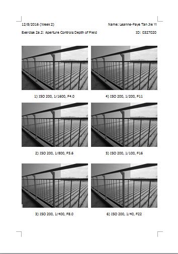
Exercise 2a.2: Aperture Controls Depth of Field

1)

 ISO 200, 1/1600, F4.0

2)

 ISO 200, 1/800, F5.6

3)

 ISO 200, 1/400, F8.0

4)

 ISO 200, 1/200, F11

5)

ISO 200, 1/100, F16

6)

 ISO 200, 1/40, F22

Screenshots: 


Feedback: 

Mr. Vinod commented on my exercise 2a.2. He said that the reason why it does not show much of a difference might be because it was not focusing in the middle and I might be using a wide angle to shoot. To prove that aperture does affect depth of field by showing that the background gets blurrier , we should not use a wide angle. We were asked to add in a screen grab of questions and answers from the forum into our blog posts. References can also be added into our blog posts. Mr. Vinod asked me to not only write the exercise number but also label the exercise which I had already corrected. 

Reflection: 
Experience 
Today was our first practical session. After the lecture on aperture, Mr Vinod asked us to take our cameras out and start adjusting the aperture, ISO and shutter speed. First, we shot pictures of Mr. Vinod using from the lowest f-stop to the highest f-stop. At the beginning of the exercise, we struggled a bit on the camera settings and so we had to retake the pictures but slowly we got the hang of it. Secondly, we shot pictures of the railing but this time we changed the f-stops and shutter speed. 

It was quite confusing for me to understand how the f-stops works so I had to note everything down then refer back to the notes I wrote during the lecture. I would say it was overwhelming as there were so many things to process on the first practical session for ITP module. 

Observation
During the session, I realised that there are many measures taken to take a picture like positioning the tripod, camera settings and lighting. I find the second exercise more challenging because it doesn't show much difference. I also realised that it is harder when you actually apply what you have learn in class into a practical exercise. I observed that each camera has different lowest f-stop and highest f-stop. 

Findings
After today's class, I learned that exposure is affected by 3 components: aperture, shutter speed and ISO. Aperture controls the amount (quantity) of light entering the lens. This is controlled by the opening and closing of aperture leaves (diaphragms) to create bigger or smaller holes. It is influenced by f-stops (numbers). A smaller f-stop means overexposure and a bigger f-stop means underexposure. The bigger the f-stop, the smaller the hole and vice versa. I also learned that aperture affects depth of field (clarity of foreground and background). When the foreground and background becomes blur but the subject matter is clear, this means it is a smaller f-stop and bigger hole. The bigger the f-stop is, the wider the depth of field. After doing exercise 2a.2, I realised that there is no obvious differences between the pictures and it might be the angle that I shot at wasn't easy to identify. I understand that we should describe as clear and not sharp when it comes to depth of field. 

Before the next lecture, I learned that I must read the slides or reading materials provided by the lecturer on TIMeS so that I would come prepared and roughly know what to expect for the next lecture. 

Share
Tweet
Pin
Share
No comments
8/7/2016 - Week 1
ITP
Leanne Faye (0327020)

Exercise 1: Presentation of 10 of your best-liked pictures

Lecture: 

Today's lecture started out well as we were briefed by Mr. Vinod about our module - Introduction to Photography. He explained about the objective and learning outcomes of the course. We were asked to create a blogger for our e-portfolio journal and we were also assigned to our first exercise/assignment. By choosing our 10 best-liked pictures and explain why we like them.

From this first lecture, I understood that I have to be more vocal and expressive about my opinions and feelings. I also need to familiarize with how to manage a blogger account.

General Instructions for the week:

  • record your audio-video presentation and upload it to YouTube.
  • write your eportfolio as per example. Embed the audio-video of the YouTube presentation link in the eportfolio.  Upload the 10 best liked images along with the descriptions unto the eportfolio. Upload the Screen-shots of the MS Word file unto the eportfolio (See example of how to write your eporfolio: http://yourbrief.wordpress.com/2013/08/26/example-post-for-the-introduction-to-photography-eportfolio/ )
  • Print hardcopy (Word file) of the 10 selected pictures with the description following the instructions (margin, font, etc.) given in class and place it in your hardcopy (portfolio) folder.
Specific Instructions for Exercise 1: 

In this exercise students will explain the reasons they like the chosen pictures, what they found interesting when taking/choosing or after taking/choosing the picture. Students’ have to choose pictures that are not their own as well but must credit and explain the circumstances of the picture. Student will present 5 pictures of their own and 5 pictures of 5 different photographers. By this process students exercise their ability to discern and reflect on what makes a good picture theoretically.
1. Content (3%):
Marking Criteria: The presentation must showcase a variety of pictures: personal(5 self shot), landscape, portrait, still life, etc. AND from 5 different international photographers. All pictures must be credited and explained.
2. Clarity of presentation (2%):
Marking Criteria: The student must be clear and concise in their delivery and explanation of their pictures. Evidence of understanding can be deduced by their analysis and evaluation, and in the confidence of their delivery.
Learning Goal: Students will be able to discern and reflect on what makes a good image theoretically.

Self Shots: 
                                      1) 

This is a picture I took during my getaway at Australia. It is taken at Smiths Beach on Phillip Island in Victoria, Australia. I find this picture very calming because the colours of the sky & ocean compliments the colour of the sand. The view of the endless horizon is just breath-taking. This is taken with a phone camera.

                           2)  

This picture is also taken in Australia at Eureka Skydeck Tower in Victoria. I took this picture at the 88th floor of the tower, which is 975 ft. above sea level, overlooking Yarra River. I love the cool colours in this picture together with the bright city lights of Melbourne. This is taken with a phone camera.

                                    3)

This is a picture I took of my sister while strolling at a park in Melbourne. I am fond of this picture as this picture gives a very autumn feel because of the fallen dried leaves and tall trees paved along the sidewalk of the park. This picture is taken with a phone camera.

                                           4)

This picture is taken in Bangkok, Thailand. It is a section of the Grand Palace which is home to the royal families of Thailand. I took a picture of this section because I find this building visually aesthetic. I am amazed by how intricate the design of the palace walls are and how well-maintained the place is. This is taken with a phone camera.

                        5)

This is also taken at the Grand Palace, Bangkok. This is at another section of the palace. I love the complex structure of this building along with its detail paintings on the wall. I also like the high contrast of the building against the light blue sky. This is taken with a phone camera. 

Other Photographers:

                          1)

This is taken by a New Zealander photographer Trey Ratcliff in New York, titled 'Inception Reflection New York'. It shows a reflection of buildings on a skyscraper which look as if there are murals of buildings painted on the skyscraper. I love how the reflection looks on the skyscraper and it makes me feel tiny compared to these towering skyscrapers.

                            2)

Taken by a Chinese photographer Quentin Shih, based in Beijing, China. The title of this picture is 'A Chinese Woman, with Lady Dior handbag'. This picture is a project with Christian Dior contributed to the House of Dior. I love how this picture looks very mysterious because of the light shone only on the woman. It emphasises on the dress and the bag because of the complimentary colours. 

                                    3)

This is taken by Line Klein, a photographer based in Copenhagen, Denmark. She took a series of pictures of different ceramic vases and this picture is my favourite because of the colours. The title of the series is 'Broste SS14'. Although the arrangement of the vases are not in order, the pictures still has a sense of unity. I love that the vases are in various shapes and sizes. The picture is heavier on the left side because there are more elements than the other side.

                                       4)


This picture is taken by an Australian fashion/travel photographer Della Bass, based in New York. It is a portrait of an American model Taylor Hill for an editorial. Her makeup and tresses are done by makeup artist Isabella Schimid. I like this portrait of her because it looks very fresh and it focuses a lot on her features. 

                                    5)


This is taken by an American photographer Kathleen Dolmatch. She is a photographer for National Geographics since 2015. This picture is titled 'The Great Divide'. It is taken in New York. On the left, it is the Central Park and on the right, it is tall buildings and skyscrapers of New York City. These two sections are divided by a long stretch of road. I love how it shows two total different use of land in the same city side by side. While one side of the city is so hectic and restless, the other is so calm and peaceful.

Screenshots: 


My Presentation on Youtube: 


Feedback: 

Mr. Vinod said the descriptions and credits are all given in the pictures I chose as required in the criteria. When writing a post, I must remember to number all pictures and also state the title. Mr. Vinod also commented on my reflection writing, he said it could be longer and we could also state additional information, pictures, sources or notes (aside from what we are required to do) can be placed below. It is best to study and understand the definition of the 3 sections in the reflection writting before writting. It is also important to credit sources from where we get our information from. We must also read the materials on Times provided by the lecturer beforehand so that we come prepared and also roughly know what to expect for the next lecture.  

Reflection: 
Experience
Having to keep up with everything being said in the first lecture was overwhelming yet exciting. I have no experience in managing a blog so I had to figure it out by referring to examples of an e portfolio which has taught me many basic things in starting a blog.

Observation
I realized that this module is not an easy one and it is going to take a lot of determination and hard work. I noticed that I have a lot of space for improvement in editing a video and expressing my thoughts in classes.

It was slightly harder for me to find the 5 pictures from other photographers than finding photographs taken by myself. 

Findings
I learned that photography is not all about taking good pictures but understanding the story behind the picture. After learning the stories behind the pictures, I find the pictures much more meaningful and has a greater value. 

To conclude, I have learned a lot from this exercise by exploring many photographs from different sources and I would love to learn more in upcoming classes on how to take pictures more professionally.  


Share
Tweet
Pin
Share
No comments
Newer Posts

About me

About Me

"Normality is a paved road: It's comfortable to walk, but no flowers grow on it." - Vincent Van Gogh.

Follow Us

  • Instagram
  • Twitter
  • Snapchat
  • Pinterest
  • Facebook
  • Youtube

Labels

  • advertisingprinciplespractice
  • brandingcorporateidentity
  • contextualstudies
  • developingexpertise
  • freshid
  • illustrationandvisualnarrative
  • introtophotography
  • publishing1printmedia
  • typography

recent posts

Blog Archive

  • ▼  2018 (4)
    • ▼  June (4)
      • S2 Fresh ID: Project 1
      • Developing Comm Design Expertise: Illustration
      • Developing Comm Design Expertise: Typography
      • Developing Comm Design Expertise: Photography
  • ►  2017 (19)
    • ►  December (8)
    • ►  November (3)
    • ►  October (2)
    • ►  July (2)
    • ►  June (2)
    • ►  May (1)
    • ►  April (1)
  • ►  2016 (32)
    • ►  December (3)
    • ►  November (7)
    • ►  October (8)
    • ►  September (9)
    • ►  August (5)

About Me

Unknown
View my complete profile

Search This Blog

Created with by BeautyTemplates| Distributed By Gooyaabi Templates