
Typography | Week 1 - 5
28/3/2017 Week 1 - 25/4/2017 Week 5
Leanne Faye 0327020
Typography - Exercises
Calligraphy, Lettering and Type Expression
Typography - Exercises
Calligraphy, Lettering and Type Expression

Lectures:
28/3/2017 Week 1
First week of lecture started off with Mr. Vinod giving us a brief introduction to typography. We were then separated into groups of 3 to do a small in-class exercise. We were told to look and research on a calligraphy hand and present it to the class. Yau Yi and Nouval were my group mates for this exercise. We researched on a font, Pf Champion, which was not a calligraphic hand but a font instead. When we presented, Mr. Vinod and Mr. Shamsul corrected us and explained to us what was the difference between a hand and a font. After the exercise, Mr. Vinod told us what we need to prepare for this module. First was calligraphy pens, slanted or straight ones, 2.0 or 3.0. Second was graph papers A4 size. Lastly, a blog/e-portfolio, lucky for me, I already had a blog created previously for Mr. Vinod's class on introduction to photography during my foundation. He showed us example on what we have to do for this week's take-home exercise, which is practicing our horizontal, vertical lines and circular lines on graph papers using calligraphy pens.
4/4/2017 Week 2
Second week of lecture, Mr. Vinod and Mr. Shamsul asked us all to show our exercise from last week. We all gathered in each table one by one to look at each others work while both lecturers gave their feedback. After that, we started our lecture on basics of typography. Mr. Vinod explained a few companies that uses their own in-house fonts. We also learned a bit on job scopes, like example, lots of jobs are taken into one profession therefore number of craftspeople decreases as well as the quality of the end product. We also got to understand how skilled typographers has affected effective communication, for example, it has affected students that's reading textbooks. Mr. Vinod then moved on to terminology of typography, explaining about font, typeface and type family but he did mention the terminology issue is controversial as it depends on who is explaining it or what we are reading from. He also mentioned areas we will cover in this semester on typography. Next, we were asked to choose a calligraphic hand for exercise Calligraphy & Lettering. We then have to print out the hand we chose and attempt on writing the alphabets on graph paper in class. Our take-home exercise was lettering a 12-words quote using the chosen hand.
11/4/2017 Week 3
Third week of lecture, again we started off by gathering in each table to look at each others work and give feedback. After that, we started the lecture on letter forms and technical terms to describe specific part of letter forms. I took notes on all the terms such as apex, ascender, arm, barbs, beak, bowl, bracket and many more. Then moving on to uppercase, lowercase, small capitals, numerals, italic, punctuation and many more. After that, we continued to basics on describing typefaces and comparing typefaces. After the lecture, we started our in-class exercise, which was "drawing" our names that expresses us on a graph paper then later transferring to our laptops to digitize or animate it. We also learned how to animate our names in Aftereffects from Mr. Shamsul. Some of my classmates don't have Aftereffects so he taught us another way to do it using Photoshop.
18/4/2017 Week 4
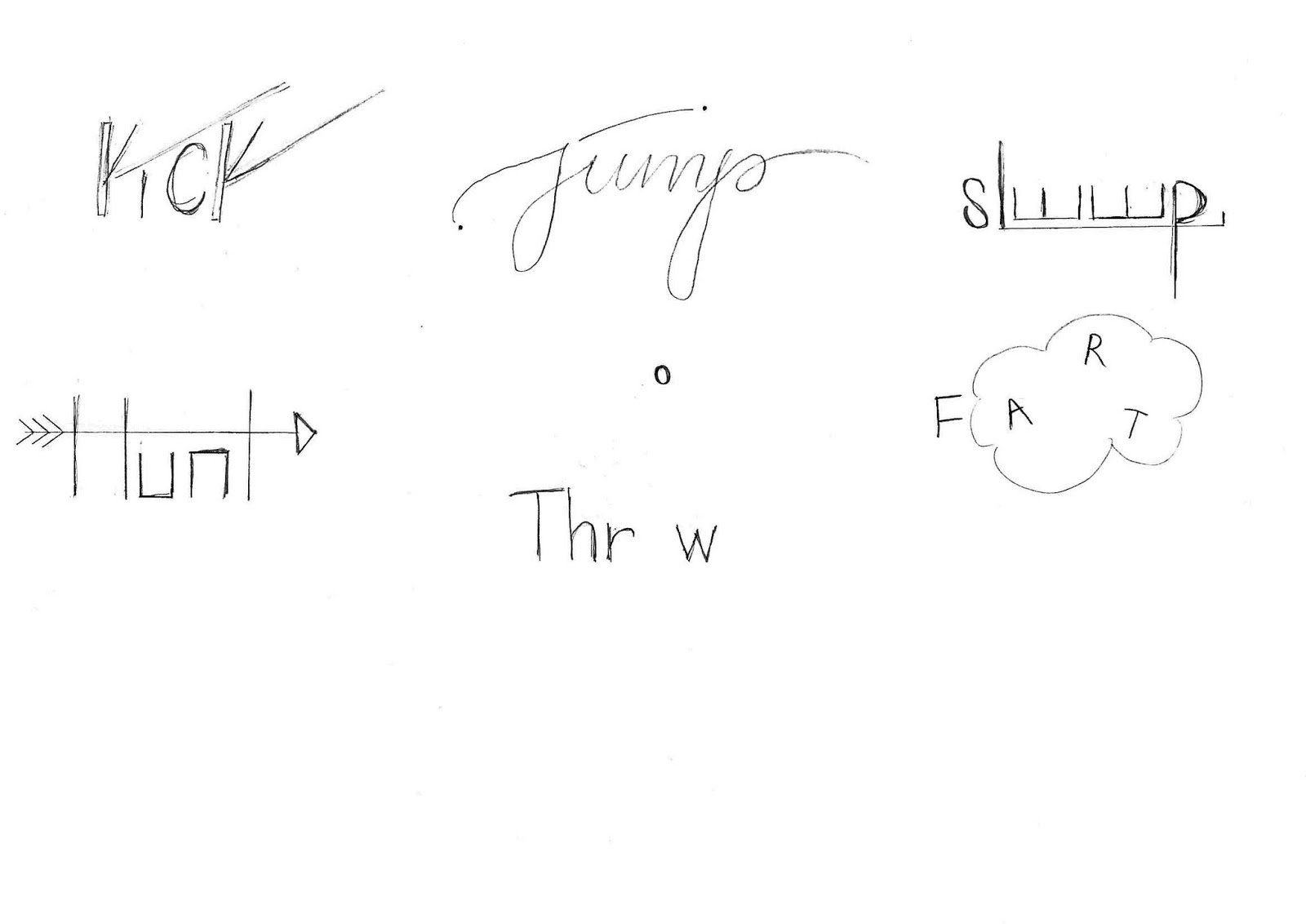
Fourth week of lecture, as usual, we gathered in each table to look at each others work and also participate in giving feedback. Next, we were given a lecture on development and timeline. Learning about early letterform development: Phoenician to Roman, like how the Greek change the direction of writing and also reflecting the letters. Second, we learned about hand scripts from 3rd to 10th century C.E. and how the thick and thin strokes created a sharp ending, whereas it became a serif font. In roman monuments, square capitals were the written version during the 4th or 5th century, but during the late 3rd to mid 4th century, square capitals cost too much because it took too much space of the paper. Somehow, they came up with a compressed version of square capitals. Thirdly, we discussed about blackletter to Gutenberg's type. Mr. Vinod also showed us simplyfied slides of humanists script to roman type and dutch printing. Lastly, text type classification and typeforms, from blackletter to serif/sans serif. After the lecture, we started our last exercise for assignment 1 which is type expression. Each table came up with a action verb, total of 6. We then sketched our rough ideas on paper then later transferring it onto Illustrator, for the final, we picked one to animate it like what we learnt from last week.
Instructions:
The Brief
Exercises.
Duration of Assignment:
4 Weeks (Briefing on Week 1)
DEADLINE:
Week 5 (25 Apr 2017)
Description
Throughout the beginning and the middle of the semester, exercises will be prescribed at various phases of the module. These exercises will aid and benefit you in your quest to gain theoretical and practical knowledge in Typography that will inform you and provide you with the necessary experience to take on the module’s projects.
All exercises prescribed are to be completed and documented (labelled, clean, clear & concise) in your eportfolio and Hardcopy portfolio respectively.
The exercises are as follows:
1) Calligraphy
2) Lettering
3) Type Expression
Calligraphy: You will choose a calligraphic hand (Round Hand, Black Letter, Uncial). You will complete the prescribed exercises (vertical lines, horizontal lines, circular lines and letters a–z). Upon completion of the prescribed exercises, you shall write a small 3 or 4 line passage/poem. You have 2 weeks for this exercise; it is to be done in class and at home. (2 weeks).
Lettering: Draw out the letters of your name (first name or nick-name). Try to capture your personality or character in the design of the letters. Using the appropriate software, animate the drawn out letters while ensuring the animated gif stays within the character and personality. (1 week).
Type Expression: You will be given 6 words to compose and express. You will be given a set of typefaces to work with. Through iteration, use the appropriate typeface and compose the letters in a manner that allows meaning of the word to become visible. (1 week).
Requirements
To complete and to showcase mastery in the exercises prescribed in its various forms over the 13-week period. This process is repeated for all 8 weeks. The work is compiled logically and chronologically in an A3 clear sheet folder and documented on the students’ eportfolio.
Submission
1. Exercises to be documented in an A4 Clear Sheet folder, logically and chronologically. The works must be labelled and dated.
2. Eportfolio posts at the end of the assessment task labelled and dated, with images captured well and in good light in so that the works are pleasing to the eye and legible.
Objectives
1. An appreciation and understanding for the evolution of Typography.
2. An appreciation of the skills sets and mental discipline required in Typography
3. To develop the necessary software skills for the typographic communication.
Exercise Calligraphy
Week 1
Lines
Vertical lines (2.0 pen)
Lines
Vertical lines (2.0 pen)
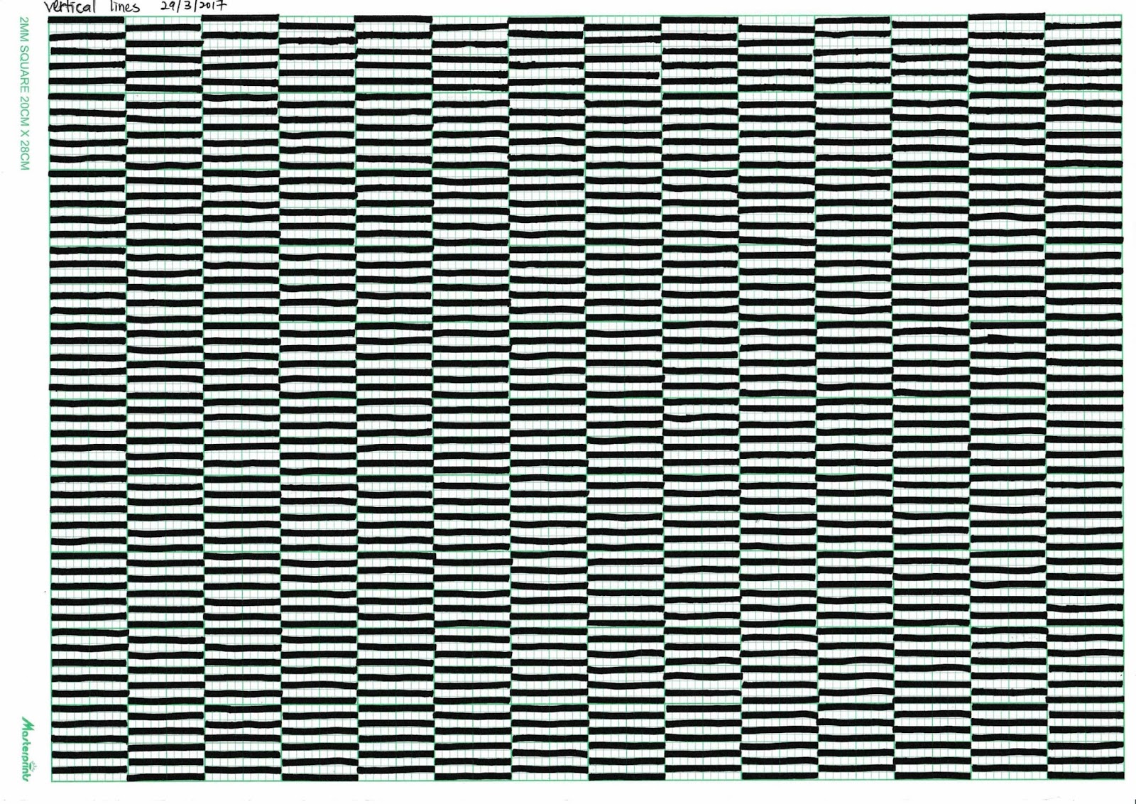
Horizontal lines (2.0 pen)


Week 2
Alphabets

Round hand that I chose.


A-Z
Quotes

Final
Quote by JK. Rowling.

Quote by Henry David Thoreau

Quote by Vincent Van Gogh

Quote by unknown
First few tries. Attempting different quotes.
Exercise Lettering
Week 3
Name Expression

Final

Final Gif

Artboards for Gif

Sketches (highlighted the chosen one)
Exercise Type Expression
Week 4
Action Verb

FINAL GIF (KICK)


FINAL 15 FRAMES
1st Attempt:

GIF (1st attempt)
2nd Attempt:

GIF (2nd attempt)

Digital Sketch of 6 action verbs
1st Attempt:

Digital Sketch (1st Attempt)

Analog sketches of 6 action verbs
Feedback:
Week 1
We did a research on PF Champion which was a font but not a hand. We were researching on the wrong thing. Our exercise to be done for the week was drawing vertical, horizontal line and circle using a calligraphy pen on graph paper.
Week 2
Vertical and horizontal lines are consistent. Circles are a bit smaller in size but thickness and thiness of lines are overall quite consistent.
Week 3
The alphabets are a bit inconsistent on the graph paper. For the quotes, the letters are consistent except the line spacing would look better if I minimized it. Use 0.5 or 0.25 cm instead of 2cm. Do not throw away test pad or paper. Keep it all intact.Week 4
Lines are consistent and very structural however the animation doesn't match the design. The thick and thin lines are very contrasting.
Week 5
My first attempt of the action verb gif was moving too fast and Mr. Vinod & Mr. Shamsul liked my gif but thought the flying 'K' was weird. Mr. Vinod suggested to just let the last 'K' fall off. For my hardcopy submission, both lecturers commented that it was very organised and well labelled. Mr. Shamsul and Mr. Vinod said the final quote is good and all attempts are well intact. For my e-portfolio, the format is systematic and correct. Later, Mr. Vinod asked me to reflect the first 'K' because it makes more sense as the stroke inclined downwards of a 'K' is called a leg to portray the leg 'kicking'.
Reflection:
Experience
Starting with the first calligraphy exercise, it was a painstaking process. I practiced a lot on rough sheets before hitting the graph paper. I didn't struggle as much on the vertical and horizontal lines. The circular line began to take it's toll on me because it's really hard to control the curving part and also remain the angle of the tip. The process writing the alphabets went quite well because it came after the line exercises where my hands are all warmed-up but it still took me a few trials on rough sheets.
Next is lettering, I had trouble choosing the best quote so I ended up writing a few. After writing the quotes, I chose the one that looks the best which was a quote by J.K. Rowling. It took me 5-6 attempts before getting to the final one and it is all filed in my hard copy portfolio.I used 3.0 calligraphy pen to write the quote and the X-height is 1 cm, same goes to the ascender height. In the quote, there is only one alphabet that has a descender, which is a lowercase G and the descender height is 1.5 cm. The line spacing is 0.5 cm, if the term leading is used then its 2.5 cm. The word space is 1 cm. The tracking between characters are considered tight. The O's includes a stress as it is handwritten. The hand I chose is a round hand.
Moving on to the type expression, we started off with names. From my sketches, I chose the last one because it represents me the most. It shows my personality which is very firm and strong. The lines I used are complex yet consistent. As for the animation, I had a little trouble understanding how to use Aftereffects as I have not tried using it before. Fortunately, Mr. Shamsul taught us another method using Photoshop, even though it requires a bit more work but it works for me. I was trying to go with a geometric animation to match my structural lines instead of a organic animation because it would turn out looking quite messy.
Lastly, action verb expression, I chose kick from my sketches to animate because it represents the strongest expression from the rest. The animation shows a little playfulness, expressing the first K nudged I and it fell over to C and finally created a kick effect on the last K. The character I used is Folio Std Medium. In conclusion, my experience for the entire assignment was quite pleasant as I love learning about types and how it gives a strong impact to our daily lives. There are also parts that was quite boring which is week 4's lecture, learning about the development and history but other than that, the experience was very enjoyable.
Observation
While doing calligraphy exercise, I realized that it is not easy to draw consistent lines without the graph paper or grids. Graph paper has a guide but when I tried on a plain piece of paper, it is not easy at all. I realized that the alphabet A and X are my weaknesses, I can't seem to write it consistently. For the quotes, I realized I wasted too much time thinking of which quotes to choose.
To memorize all the terms of typography also took me very long because I am not good in understanding the terms, therefore, I memorized it. I observed that Mr. Vinod's slides has helped me a lot in understanding this assignment as it is simple and easy to understand. For digitizing the name expression, I realized that a few classmates of mine had the same struggle as me which is using Aftereffects. For the type expression exercise, it was actually my least favorite exercise, because I realized that it is easy to create but hard to express.
Findings
What I have learned from the calligraphy exercise is that patience and practice makes perfect. I've proven it to myself by having many trial and error on pieces of rough pad writing my weakness which is the alphabet A and X. It has prove to me that if I write for the sake of getting it done, the outcome will reflect it. I arrived to the final piece of quote after numerous attempts and during the process, I find writing fast or too slow would have a higher chance of screwing up so speed also plays a part in lettering. Writing fast can make mistakes easily and have less control of the pen, on the other hand, writing slow can cause you to hesitate and have shaky lines.
For the name expression, there was a bit of a challenge for me because it is hard to express myself without color, colors are very expressive as they can show feelings and moods. Since we can't use color, I then decided to try variation of thick and thin lines to be more "expressive".
The type expression exercise was a long process because each frame cannot show too much difference, I realized the more the frames, the smoother the flow of the animation is. I personally like san serif fonts more as it seems to convey modernity and minimalism that's why I chose Folio Std Medium. The reason why I reflected the K is because I want to portray a playful and chirpy feeling.
This whole assignment has taught me that it is easy choosing a hand but definitely harder writing it. Like what Mr. Vinod mentioned, typography is an art, not easy to teach and has conventions, we can break the rules of typography but we need to know know the rule first and never break the rules ignorantly. For the basic terms and lexicon lecture on week 3, it was easy for me to understand as I have learned about this during my foundation in 2-dimensional design studies and also have read in books numerous times, so it was more of a refresher class for me. During the weekly feedback session, I find it very useful as I would receive positive and negative feedback for me to improve and also new ideas to work on from classmates. It is fun to learn from others and see the way how others perceive and interpret my work because what we see is not always what others see as well. Different people have different point of view so by listening to others helped me open up and taught me, as an aspiring designer, to not only see from one perspective.
The struggle for me was having to translate analog to digital. I am personally slower in digital work so it was a challenge for me to keep up in class. Mr. Vinod also stressed about having a seamless transition from one page to another no matter what designer you are. It is also important to be aware of intellectual property as this is supper crucial when we join the workforce. Mr Vinod had told us to not only get information from classes but also out-source information from library books or the internet.
Further references:
Books read throughout the assignment:
1.

The Fundamentals of Typography by Gavin Ambrose & Paul Harris
I was looking for an easy to understand book on typography and found this after going through many books which was not suitable for me. I would definitely recommend this book for anyone who wants to know everything about typography and also gives a deep insight of typography, it includes a brief history, basics, letterforms,words and paragraphs and using types. I read this book before week 2 and when I went for lectures, I immediately understood whatever Mr. Vinod was explaining. I extended the borrowing period too because I wanted to keep it until this assignment ends so I have a copy of reference to refer to when I forget the terminology, that way I slowly memorized and developed understandings.
The chapter I find most useful is Chapter 1: The history of type. As you know, I don't like history and it bores me so I wasn't paying enough attention in lecture. I then went home and refer this chapter to help me understand.
"Language is the dress of thought"
- a saying by Samuel Johnson obtained from the book.
What I've gained from this book:
- Language is not static. Letters, language and typography develop and change over time as the dominant power inherits, alters, adapts and imposes its will on existing forms.
- In the field of graphic arts the golden section, also known as the golden ration forms the basis of paper sizes and its principles can be used as a means of achieving balanced designs.
- The Fibonacci sequence is a series of numbers in which each number is the sum of the two preceding numbers. These numbers are also used as measurements for typeface sizes because of their harmonious proportions.
- While there are thousand of typefaces available, it is sometimes necessary to generate new ones. Fonts can be produced in a number of different ways from creating original art, replicating type from older publications, mark making or rendering type from font generation programs. The ability to create fonts electronically are in response to the specific needs and desires of clients, designers and typographers.

Visual Communication: Images with Messages (6th Edition) by Paul Martin Lester
I came across this book in the library as it caught my attention. In this book, there is a chapter on typography in visual communication. I did not finish this book because not all chapters seem interesting to me so skipped a few chapters. This particular chapter on typography describes 6 perspectives.
"It is a rarer gift to lay words out properly than to write them."
- a saying by Nicolas Barker obtained from the book.
What I have learned from this chapter:
- Personal perspective - Typographical choices can guide a viewer toward understanding the literal message of the words and toward perceiving symbolic meaning. Artists want their work to have a neutral reaction, they want their choices seen and responded to by a viewer.
- Historical perspective - Writing has transitioned from drawing to mechanical and then digital production. Typography is linked directly to the history of writing.
- Technical perspective - In order to analyze the use of typefaces in print or screen communications, we must be aware of the various choices available to a typographer.
- Ethical perspective - If typefaces are are made to draw attention or to satisfy a designer's personal needs, then hedonism may be at work. The world is certainly large enough to support both dynamic, cacophonous displays and quiet, traditional typographical presentations.
- Cultural perspective - Typography gives the artist's style to a text, it is linked, as is any art form, to a particular culture at a particular time.
- Critical perspective - The field of typography reminds us that what is considered acceptable or good is when the text choices match the expectations of an intended audience.

0 comments